Tuesday, 15 December 2015

group meetings

The purpose of having a group meetings table is simply so that every single member of the group is aware of exactly what is going on in the production of the music video. It is vital to have to ensure that say for instance, someone is not in a lesson one day, they may miss something crucial to know in the meetings and therefore when they come back they can easily refer to the table and catch up with what has been done and what still needs doing. Meetings are also an extremely beneficial way of allowing everyone in the group to have a say in a matter; if everyone has differentiating opinions of how best to approach something, a discussion needs to take place to compromise of what action to take. Another useful aspect of the group meetings is that it allows a group to efficiently divide tasks between the members and get things done a lot more quickly, saving valuable production time, as well as making everything fair between everyone, so no-one either has nothing to do or everything to do. The table below demonstrates our planning of certain actions we need to do, when to do them by and by whom.
Having carried out  group meetings very successfully, I think it is an ideal thing to do. The process was a lot easier and quicker due to the fact that Molly, Claire and I get along very well and were able to maturely discuss our ideas; it was also beneficial that the three of us held similar ideas and therefore could quickly move on to looking over other things. In addition, having three people in a group proves to be advantageous when discussing how to approach a situation as it means that there is a high probability you will receive constructive input from at least one person, or if you do not like one person's, someone else can jump in and help.


Overall, from carrying out group meetings, I can see that it was a good thing to use as it helped with organizing our production efficiently and constructively, allowing my group and I to know exactly where we stand with deadlines. Every participant of the group attended each meetings, avoiding any issues with one of us being behind on key information regarding the production. This meant that we all knew exactly what we were doing and what was left to do. The only issues that arised were ensuring that our schedule did not come into conflict with either each other's or Amy's, who we were using as our artist. However, if I were to repeat this process, next time I would plan out variables such as weather and lighting more carefully, as we actually had to re-film a scene due to the poor lighting resulting in a grainy quality from the camera.


Thursday, 10 December 2015

photoshoot


The reason why I had to take pictures is simply as they play a crucial role in promoting the artist and their music as much as possible. Pictures are a successful promotional tool as they connect the artist with the audience; the latter does not want to see a lot of text in a magazine advert or in their digipak. Images should be the dominant aspect as they appeal to the audience. People buying a magazine with an artist such as Gabrielle Aplin promoted on it or buying her digipak would want to see artwork rather than information as the indie genre is all about creativity. Pictures give the artist the chance to express themselves creatively and come up with innovative ideas to engage with the audience. For my own advert and digipak, I had to take various pictures; these includes images of the artist as well as images of indie locations I thought were suitable. I had to ensure that I took a variety of shots of both the artist and any additional pictures, such as location images. This is simply as having the same type of shots is exceedingly dull and unappealing for the audience. In my own digipak, I have used different angles in my six different images which helps to maintain interest and creativity throughout the digipak so that the audience can feel like they are really getting something back from the artist. It is also important to have a variety of shots as when it comes to editing, you may find that you did not actually like the style of shot that you originally intended for. When I took all my images, I made certain that I took lots of different shots from different positions and angles, e.g. some in high-key lighting, some in more low-key lighting, some quite close up and others further away. The reason for doing so is when I initially took pictures for my magazine advert, I accidentally took them too close up to the artist and therefore when I placed the image in Photoshop and made to enhance the size, the artist was standing a lot closer to the camera then I wanted. Therefore, I had to re-take the pictures whilst standing at a much longer distance.


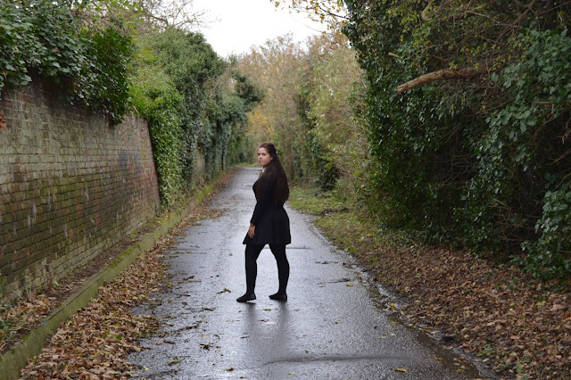
Above are two screenshots of the original picture I used for my magazine advert, and the picture after I edited it. As you can see, they starkly contrast as the original image has been taken during the day-time, whereas the other has been edited so make it appear to be set during the night-time. The reason I took a picture of this image specifically is because I was inspired by Bastille's "Bad Blood" album cover, which features the artist alone on a road during the night. However, I evidently did not want to copy the album pixel for pixel, so instead decided to manipulate this idea in my own way. I thought having the artist standing still on a road with their back to the camera but their face directly towards it would create a lot of connotations regarding the artist. I wanted to portray the artist as being quite dark and enigmatic, but evidently not venturing into the rock genre. When I took this image, Amy was actually in her school uniform, however when I planned out this shot, I wanted her to be in dark clothing as I did not want the clothes to be the main focus in any way. The darkness of the clothes juxtaposes with Amy's face, making it stand out more, which is the outcome I was intending. The choice of location for this particular image was also crucial; I did not it to be in a field as I wanted to get the sense of the artist travelling down a road, as this reflects personal journey. However, I wanted to capture the image in a location that still reflected the indie genre, hence I picked a place surrounded by trees. Another mediated aspect of the image is the position of Amy in the picture. When I first took pictures for my magazine advert, I mistakenly took them too close up to Amy and therefore when I inserted the image into Photoshop and stretched it to fill the page, Amy was standing too close to the camera for my liking. Therefore, I re-took the pictures and ensured that I was standing at a good distance from the artist, and at a position that a good bit of road was shown, as well as the trees. I had another issue in the original taking of the image in that Amy was not positioned centrally in the shot and therefore you did not clearly see that she was on a road; the second time round I made sure to change this. From looking at all aspects of the image, I can see that the image both conforms and subverts the indie genre conventions; it follows the conventions in that the location and the use of a long angle shot as opposed to a close-up shot, has followed indie expectations. However, from research I have seen that images of the artist playing a musical instrument in a field are far more conventional than the artist alone on a road at night. Despite the subversive aspect of the image, I am glad I chose to take this image and edit it as I did as I think it makes a far more interesting and unique image for a magazine advert.
This way, the audience will find the magazine advert far more appealing than your stereotypical image of an indie artist as it provides them with the reassurance that the artist's music will also be different to what they conventionally and perpetually hear all the time in the indie genre. The good thing about my image is that it gives me the freedom to use a lot more editing, which may not be a convention of the indie genre, but I can create a much more appealing image; for example, I can edit the colors of the image so that they contrast well with the colors of the text. I can also use editing techniques such as outer glows on my text, which I already have, which I would not have been able to do with having my image set during the day-time. I think little editing bits like that make the image better served for a magazine advert. To the right is a screenshot of the final version of the picture where it has been used for my magazine advert.
For my digipak, I wanted all the pictures to be quite different from each other. Therefore, I made sure that they were all taken from different angles and positions so that the audience would feel they have been given something that the artist has put a lot of time and effort into. One of the images I used was of Amy sitting by a brick wall. The reason I chose this image is because the location was something that you would stereotypically find in the indie genre; therefore, if it were in a digipak, the audience would automatically be able to recognize the genre of it. Instead of having Amy standing against the brick wall, I chose to have her sitting down as the picture has been taken at a slanted angle that enables you to see all of Amy as well as the wall behind her and the surrounding location, such as the stream. This way, the picture appears to be more than just a simple picture of the artist standing at a brick wall, facing the camera. Instead, it seems to have been given a lot of thought and a creative input. I did not want Amy to be looking directly at the camera as it would have ruined the natural look I intended. Amy looking up rather than directly straight just made the image look a lot more interesting; it also corresponded to other images I took where I avoided having pictures of Amy looking straight at the camera. This image will be used as one of my blank images for my digipak, as I play around with the editing a lot to make up for the lack of text. I do think it is a highly conventional image, as both the location of the image, and the costume that Amy is wearing are elements you would automatically link to the indie genre. The costume is a good way of helping to build a relationship with the audience as they can aspire to have the clothes that Amy is wearing.


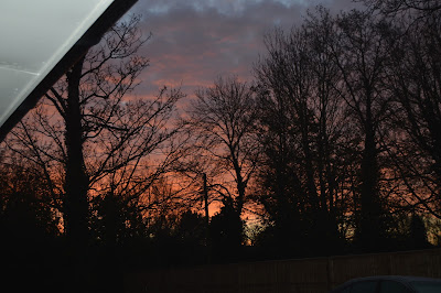
The image I decided to use for my CD is actually of an indie location rather than featuring the artist themselves. The reason I chose to do this is because from prior research I discovered that it is highly unconventional of the indie genre to feature themselves on a CD case as they like to put focus on a design or idea rather than their own selves. For my CD design, I took a variety of images of the nature around me; as I live in the countryside I was able to make use of the fields and trees alongside the sunlight to get a good indie style picture. Some pictures were taken at sunrise and others nearer to sunset but during daylight. From looking through them thoroughly, I decided the best one to use would be the one where the sun was rising as it fitted with the album title of "desolation". As the colors of the image are quite vivid, it meant that I did not actually have to edit it a lot; I simply increased the contrast and decreased the brightness, as well as slightly changing the hue, to give a strong red-ish color. The reason for doing so is because I wanted the CD to reflect the album title; the word "desolation" has quite negative and powerfully destructive connotations, which I think my image reflects. I think the image I chose for the CD is both conventional and subversive of the indie genre; normally, images would be quite soft and gentle-looking in comparison to my own. However, it is highly conventional of the indie genre to use images of nature, as it reflects the rustic and natural style of the music. Despite the colors of the image being subversive, I think the CD would not look as good if it were in daylight, as firstly, it would not be particularly striking, and nor would it fit in as well with the rest of my images. The images in my digipak vary, with some being quite dark and others lighter, and therefore I wanted to keep to this theme. Overall, I think the edited image is quite good and fits in as a CD design, as there is not much occurring in it; it is a simple image which simple editing, fitting in with the simplicity of the indie genre and my other images. The darkness of the image juxtaposes well with the white colors I have used for the text; whereas a light image would not have the same bold effect. In terms of the audience building a relationship with the artist, I think they successfully can as the image has been taken of a location that is accessible to all people, in that trees are all around them. If an image such as one of the artist's face was used, then it would not have the same effect; the album would actually seem to be less about the audience and giving them something back but rather focused more on purely the artist. Instead, an image of a location that the audience see everyday but captured at a beautiful time of the day and further edited would mean that the audience would appreciate the CD more. Having an image of yourself is easier than having it of something more meaningful; the image reflects the indie genre.
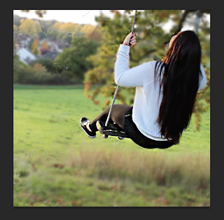
Another photo I have decided to use is a picture of Amy, the artist, on a swing. This photo has been used for my personal note side of my digipak and is actually in the same location my group and I used to film the scene where the couple in our music video first meet. Therefore, if the audience have seen the music video, they may recognize the location or the costume or iconography of the image. The reason I have used this image for my digipak is because I think it represents the artist as the target age group are seen to be: young and carefree. Having the swing in the image automatically springs this connotation as swings are obviously associated with young people. Despite the fact that it is a personal note and therefore makes more sense if Amy were facing the camera, I thought having an almost caught off-guard image where she is swinging would look more natural. I also wanted the tree and wide scope of the field scenery to be featured in the image and therefore it looked a lot better to have Amy with her back to the camera. In addition, having Amy aligned completely to the right and leaving the whole left side of the image blank (in terms of something with a lot of color obstructing it) means that my personal note can fit in nicely. The positioning of her head helped to mediate this natural look as when you actually swing, you have your head up. It also helps with positive connotations for the image as raising your head is a sign of happiness; this links with the use of the image as due to the fact that this is for a personal note, the artist needs to be happy. As it is for a personal note, I wanted the image to be taken in a location that completely reflects the indie genre; the use of a field is highly appropriate. Due to this, I do think my picture is truly a conventional indie image as I ensured to keep the natural lighting and colors of the original image when I came to editing it. I did not want the personal note to be edited too much in terms of coloring, as I wanted to maintain a stereotypical indie look. The natural colors and lighting also reflects the authentic representation of the artist I want to get across to the audience. I think this makes the image more successful than if I excessively edited it as personal notes should be less about show but rather about meaning. This subsequently allows a good connection to form between the artist and audience as the latter will appreciate the genuine nature of the 
mage. Furthermore, the fact that Amy is not facing the camera tells the audience that the artist is not concerned with themselves but actually about their music and giving the audience something more; the image and the personal note will therefore correlate well. I have not quite finished my personal note for my digipak, however the editing styles I have chosen is simply blurring out the background and slightly sharpening just the image of Amy out of the whole picture.

Overall, I found taking pictures for my advert and digipak relatively easy as I had previously planned out exactly what shots I wanted at what time, angle and location. Therefore, if my group and I were filming a scene for our music video in a location where I needed an image, I could easily just quickly take a few. However, whilst I was taking the pictures, I admittedly did fail to take into account variables such as the lighting or the position of the camera to the artist. When looking at the camera display, the image sometimes does not look as pixelated as it would if you were to then put the image onto a big screen computer. The low quality of the image simply derives from the poor quality lighting. Therefore, once my group and I made this mistake when filming a specific scene in our music video where the lighting was poor and we watched it on our Mac and realized how grainy the image looked, I ensured when we re-filmed this scene that I would re-take my images I needed from this scene in better lighting. I also made the mistake of taking shots of Amy at too close of a position in another circumstance and therefore had to re-do the shots to rectify this error. However, after I overcame these setbacks, I found that I was able to quickly get the shots I desired as I experimented with the settings on the camera to ensure the lighting was appropriate. I found that it was better to take all my images in high-key lighting as it made editing a lot easier in terms of retaining the quality of the images. Planning out the images I needed before actually going in to take them was exceedingly beneficial as it meant that if one member of the group was filming a specific scene without the person who needed a shot from that scene, then they would be able to show the person filming their plan of the images they want and then that person would be able to take the pictures for them. This happened in my own group on more than one occasion. I asked Molly to take some images for me of Amy in the field, Molly asked me to take some pictures of Amy when I was taking pictures for my magazine advert and Clare asked me to take pictures of London when I was up there filming for our scenes of London in our music video. This saved so much time as it meant that we did not have to keep going back and forth, if we could just film and take pictures on the same occasion.

Monday, 7 December 2015

creating individual magazine advert


Magazine adverts are extremely crucial for a music artist as they promote the artist and their music even more. As adverts are positioned in all different places, such as bus stops, tubes and train stations, as well as billboards, a wide range of people would see the advert. This helps promote the artist further and they will make more sales. In addition, this method of advertizing helps the artist to reach a larger number of their target audience; for example, for Gabrielle Aplin, she would want 15-25 year olds who enjoy the indie genre to notice the advert. Magazine adverts also creates synergy between the artist and another company as the latter will help advertize and promote the artist, and their music; if the artist is featured on a magazine, there will most probably be an interview to coincide with the feature and therefore the audience can go learn more about the artist. To create my magazine advert I took my own pictures and then used Photoshop, a photo editing software, to edit the pictures and add in the rest of the components of the advert. The reason for using Photoshop CS6 is simply as it is the easiest software to edit pictures to a high quality standard. Through my research and planning I gathered various inspirations to use when creating my own magazine advert. For example, I did some research into Gabrielle Aplin's magazine advert for her debut album "English Rain", which gave me the idea to go beyond using purely white as a color; instead, I have mixed white and blue together as well as used hints of grey colors. I also had the idea to use more than one color for the text from Gabrielle Aplin's advert; the use of a color gradually increasing or decreasing was extremely appealing. I also used inspiration from Bastille's album "Bad Blood", as his image is featured on a road at night, which I thought would be more unique than your stereotypical use of photographing the artist in high-key or bright natural lighting.


This is a screenshot of my finished magazine advert. There are various elements of it which I have kept the same as the draft I made for the advert earlier, and other elements that for a specific reason I have changed. For example, in my draft I planned to use an image of a road as it has the white lane markers on them. However, as there was not a nearby road that had a lot of vegetation around it, I had to use an alleyway that I found. Nonetheless, this did not cause to be too much of an issue as I merely worked around this change. However, I did have to make another change: I originally planned to make Amy's face quite bright in comparison to the rest of the image; however when I did increase the brightness on just her face, it created an effect of making her look exceedingly photoshopped into the image. Therefore, I decided it would be better to make her face match the low-key lighting I created, and instead make other aspects of the photo brighter. The actual image itself was taken during day-time. However, as I stated earlier, I was inspired by Bastille's "Bad Blood" album to actually make the advert be set during night-time. In order to do this I had to use a black and white filter on the image and then place a solid fill color of royal blue on top; this created the dark cool tones that look like a night-time image.
The reason I chose a night-time look is 
simply because I wanted to create a particular representation of my artist: instead of conforming to the stereotype of indie female artists being innocent and even angelic, with the use of high-key or bright natural lighting, I wanted the audience to perceive the artist as more than just that. This way, the artist is represented as quite ambiguous and frankly, an enigma. With the juxtaposition of the use of white and related colors and the darkness of the background, the audience do not have a simple idea of who the artist is, which is actually more appealing for them as it engages them with the artist's music so they can find out more about them. I also deliberately chose to leave the five star rating of the music magazines in the shown yellow-gold color, instead of changing them to a dull color, e.g. black, as I did with the logo of the two music magazines I used. This was simply to add to the contrast of the colors used. The actual colors I used for the text were significant in shaping the overall look of the advert. When I first inserted the title of the artist into the advert, I put it in white. However, after doing so, I realized that the color of white actually made the advert look tacky and not genuine. Therefore, I played around with the colors, experimenting with colors of a consistency of white and blue mixed together. This led me to choose a subtle white-blue color, which blended well with the cool blue tones of the image. However, for the title of my album, I actually chose to use the color white instead, as on this title, I played around with some effects and placed an "outer glow" effect on it. This gave the title a yellow-colored glow around it, as if there was lighting luminating from it. As this helped with the ambiguous representation of the artist, I kept it in. Furthermore, the use of both light and dark aspects to the advert help to connote the two varying aspects of the music video I also made: the happiness of the couple when they are together and the sadness of when the male character dies at war. Therefore, when choosing all the colors to use for the advert, I have ensured to remember both the genre of my artist and the elements I have included in the music video, so continuity is upheld. As I mentioned earlier, I was also inspired by Gabrielle Aplin, as in her own magazine advert the colors she used for her text gradually increased or decreased in shades of color. The reason I appealed to this is simply as when I put my own text in one shade, it did not actually look particularly innovative or exciting. In addition, the use of more than one color matches the idea that there is much more to the artist and there are varying emotions throughout the album. This is actually more appealing for the audience as they will most likely be prominent indie fans and therefore would want to see that an artist's album is packed with emotions, unlike other genres such as pop. 

The actual language of the text itself has been kept quite minimalistic; I have only included the essential information needed. Alongside the artist's name and the title of the album, I have included the release date (the album is "out now") as this is crucial for the audience so that if they do want to buy it they will not have to spend time doing extra research as to when to purchase it; this will be more likely to put them off buying it if they do not have the time to look it up. I have also included what format the audience will be able to buy the album on: the album comes in both an ordinary CD format and a deluxe CD format, in case more avid members of the audience want something more. I have also stated that the album comes in a vinyl format as there will definitely be some members of the audience that own a vinyl player and perhaps prefer to collect vinyls than CDs. This gives the audience a range to choose from, catering to a wider audience. Actually ensuring to include the different formats on the magazine cover is essential as it means that, say for example, a member of the audience only listen to music on vinyl players, they will be confident in the knowledge that they can actually purchase the album; some albums do not have the option of coming in the format of a vinyl. I have also included the name of the artist's website as this is both a promotional tool for the artist but also something to give to the audience to find out more about the artist and their music. Including a website demonstrates to the audience that the artist is actually quite successful as having your own website must mean that you are quite established. This is more appealing to the audience as it subliminally sends a message that the artist's music must be quite good. I have kept the name of the artist's website the same as the artist's name for continuity and professionalism. The actual name of the artist was picked by my group and I, as the actual name of the person we chose to use as our artist is Amy-Michaela. We thought the use of a double-barreled first name would make our artist seem more authentic and successful, rather than having her first and surname; a lot of well-established artists only use their first name: e.g. "Beyonce" or "Adele". Another piece of information I included was the use of a few of the singles that would be included in the album; I chose specific language to write this: "includes the acclaimed singles". The use of the word "acclaimed" is important as it subliminally tells the audience that this is an extremely successful artist, as the word is typically used on magazines or adverts to describe things that are award-winning. I have ensured that the language I use on the advert is minimalistic but includes everything necessary to make a magazine advert as successful as possible. The final piece of information I included in the magazine advert was the use of a rating from two famous music magazines. This again, if a device to attract the audience's attention and persuade them into buying the album, as well as promoting the artist as being so successful that two highly reputable magazines are giving the album five stars. Another reason I included in a rating was simply as it lifted my magazine advert to look more like a genuine magazine advert, as from research I discovered this was a convention.
The typography I used for the advert also contributed to any impressions or connotations made by the audience. All the fonts I used, which was only two different types, came from dafont.com as the website had a large selection of different types of fonts, including a "handwriting" style font. As I really appealed to Gabrielle Aplin's choice of typography, I wanted to find something slightly similar for my advert. Therefore, for the artist's name, I wanted something more blocky and bold, rather than swirly. This is simply as the artist's name should be the first thing the audience read and therefore should stand out the most. The name of the album is evidently important, but the artist's name must be more establishing and easier to read. As the font was so clear to read and also looked extremely nice, fitting in well with the rest of my advert, I decided to use it as the base font; that is why all the other pieces of text are also written in the same font. However, as the title of the album also needed to stand out in its own way, as this is what the advert is promoting, I decided to put it in a different font. The swirly and more elaborate font I picked for the album title was deliberately chosen as it actually slightly contrasts with the other font, as it is more girly and actually seems like the artist herself wrote it.

I do think that my magazine advert is indie; however it does slightly subvert the conventions of the genre. It is a lot more conventional to see a magazine advert for the indie genre with the artist photographed during daylight, typically on a field. However, I wanted to make my own magazine advert as unique as possible, and ensure that it was not your stereotypical, almost girly, advert. Having the image set during night-time brings about representations of the artist that you would not normally associate with the indie genre, such as the artist being an enigma. However, the image still reflects the genre as a lot of indie music is quite sad, and therefore the darkness of the image both conforms to the indie conventions, as well as foreshadows the music that will be in the album. From my research, I discovered that a lot of indie magazine adverts portray the artist being quite rustic; for example, the artist may be carrying or playing a music instrument in an indie location. I also discovered that a lot of the images taken have made use of natural lighting to explicitly illuminate on the artist's face so that you cannot clearly see the artist. Despite not using a musical instrument for my advert - simply as in my group and I's music video, we used a piano, which is not something portable - I chose to capture the image of the artist in quite an indie location, as shown by the surrounding trees. I also picked up on the use of obscuring the artist's face as close-up images are not conventional of the indie genre; this is why I deliberately photographed Amy at quite a far away position.

From looking at all aspects of my magazine advert, I can see that there are various parts of it that are different from what I intentionally planned out in my draft. For example, I originally panned out to take the photo of Amy on a road, not an alley-way. However, I had to change this as there was not a nearby road that had a lot of vegetation surrounding it. It is slightly disappointing that I did not take the shot I initially intended to as my originally plan was to make certain aspects of the road a lot brighter than the rest of the image, such as the white lane markers on the road. Another thing that is different between the draft and real thing is the use of a shadow around the image of Amy. When I was editing the image of just Amy, I was playing around with some of the tools and came across this shadow effect; when I put it on, I really liked the look of it as it actually looked like a second Amy was coming out of the original Amy. This linked with my continuous theme of creating an enigmatic artist and therefore I decided to keep it in. Despite these changes made, I do not think they impacted upon my advert too much as everything else in my advert has stayed the same. I ensured to stick to the rest of what I intended to do, with the exception that I did actually anticipate to take the picture of Amy during night-time, instead of using Photoshop to drastically change the lighting of the image. I have also ensured to keep the layout and design of the magazine advert the same as I did in my draft. As I wanted the image to be a centre of focus for the audience, as Amy is nearly in exactly the middle of the picture, I positioned everything else, i.e. the text, at either the top of the advert or the bottom of the advert; anything in the middle of the advert would have looked highly unprofessional. During the creation of my advert, I kept this layout plan exactly the same.

When I actually came to making my magazine advert, there were many strong and weak points I had during the use of Photoshop. The weak points included that when it came to actually changing my image from day-time to night-time, I struggled to make it look genuine and not photoshopped. I actually had to look up a tutorial in how to make the change and then consult with external help as it was not an easy process. However, I did eventually overcome this issue and was able to move on. At first, I experimented with the different available filters on Photoshop to get the desired night-time look. For example, I tried using black and white, and changing the brightness, contrast and saturation; however, the image ended up looking too much like the soul genre. I eventually found the correct tool to use, which was to create a new "adjustment layer"; I created a solid fill of a navy blue color which when I layered with the black and white filter, on top of the actual image I was editing, created that needed night-time look. I then simply played around with the brightness, and contrast, to perfect the image. Another thing I struggled with was becoming accustomed to using the layers in Photoshop; on more than one occasion, I struggled with trying to change the brightness or contrast of one layer, as all the layers seemed to be affected. I did not actually resolve this issue quickly, and spent a lot of time trying to fix this issue. As it was the image I had cut out of Amy, I ended up copying this layer into a new Photoshop file and editing it separately, and then copying back onto the original file. However, I did have some strong points when it came to using Photoshop. I was quite good at using all the tools and actually had to use quite a few; I ended up using the lasso or magic wand tool quite a lot, alongside the eraser and blur tool. As these tools were necessary for editing my advert to the fine detail, it was good that I was able to quickly use them. The reason for using tools such as the lasso/magic wand or blur tool is, for example, I used the magic wand tool to select the image of Amy out of the entire image so I could cut her out onto a new layer. This way, I could edit her separately from the rest of the image. However, when I put her back into the main image, the outer lines of her image where jagged and therefore I had to use the blur tool to smooth out the edges so you could not tell Amy had been cut out. This helped to maintain a professional look of the advert and allow me to edit the images to make the advert look even better.

From looking at all the various elements I have used in my magazine adverts, I can see that it would appeal to my target audience for a number of reasons. Firstly, I have ensured to be very careful and precise in the layout of the advert; I have tried to make sure everything is somewhat symmetrical so that the audience can see that the artist actually cares about giving good quality to their fans. For example, in the music magazine ratings, I was initially only going to use one magazine, however, it would have looked odd, so I placed two either side of the five gold stars, to maintain precision. Another way the magazine appeals to the target audience is though the use of indie-looking text. I made sure that the text I used would automatically shout out that this is an indie magazine; this appeals to the audience as when they see a magazine advert, they do not want to have to read the content inside to know what genre they are looking at, as if they do not even like that genre, they would not want to pick up the magazine. The use of an indie location in addition to the indie text is also helpful in appealing to the audience's expectations; the countryside location gives it a rustic feel and overall helps to promote the artist as being an authentic indie artist. I think all the elements I have used in my advert help to promote the artist and their reputation very successfully, as I have maintained a lot of the indie codes and conventions, such as rejecting close up images of the artist's face and the costume, makeup and location used. In addition, the image of the artist I did use still allows the audience to see the artist's face and she is shown looking directly at the camera, with a neutral facial expression, connoting confidence; this is both appealing to the audience, as well as successful in promoting the artist to be an engaging character. This is due to the fact that the target audience are predominantly female around the ages of 15-25 and would appeal to the notion of strong independent femininity; therefore, if the artist is standing alone, looking confident, it engages the audience more and establishes a respectable reputation for the artist.

Overall, I think that my magazine advert both conforms and subverts the genre conventions. There are various aspects to it, such as the use of night-time and the location being set on a road instead of on a field, that subvert the genre conventions that I researched. However, there are also elements that I have kept similar to other indie adverts that I have seen in my research; the use of a long shot as opposed to a close up shot of the artist is a prime example. I think my magazine advert is successful as it does not completely conform to genre conventions; it is of course mandatory to have conventions included as the audience will expect it, but as I have not made your stereotypical advert, it makes it more unique, which I personally think makes an overall more successful advert as it attracts the audience more. If the audience recognize the artist's name, they will know that they belong to the indie genre, yet if they see this magazine advert they may become curious as they would perhaps expect to see something else, not an image taken during the night. Therefore, I do think that my advert appeals to my target audience, as 15-25 year olds appeal to creativity and being unique, rather than rigidly sticking to what is expected, like an elder audience would prefer. Also, the use of contrasts and opposites within my advert, e.g. light verses dark, would appeal to my target audience as they look beyond the surface and actually take the time to think about deeper meanings of the advert. Therefore, they would be more likely to recognize that the contrasts within the advert represent varying emotions of the artist within the music. As well as attracting the audience, creating this magazine advert helps to promote my artist's album and specifically the music video I created, as it creates synergy. Synergy is used by media institutions to use various platforms to sell an overall product. In this case, the magazine advert is a tool used to promote and sell the artist's album. Using synergy in this circumstance means that more people will be likely to purchase the album as more people will see the magazine advert as it is on a different platform to say, a TV advert; magazine adverts are displayed all around outdoor places, such as tube, train and bus stations as well as billboards. However, less people will be likely to sit down and watch TV to see an advert. If someone has watched the music video or seen something else relating to the album, they will recognize it in the magazine advert, or vice-versa, which upholds continuity. 

Monday, 16 November 2015

planning individual digipak


In comparison to jewel-case CDs, digipaks are a far more effective format to use to promote an artist and build a relationship with the target audience. This is due to the fact that a digipak is more personal as it contains a note from the artist to the audience; this builds a relationship as it is a way to make the audience feel like they are personally receiving something from the artist. Furthermore, a digipak makes good use of presenting artwork and images as it contains a booklet; again, this is a way of the artist giving something more to the audience than just a plain CD. The artist is also further promoted as more information about them is provided for the audience to look through and therefore really get to know the artist; also, it sets the artist apart from other artists and therefore the audience would appeal to their music more, consequently perhaps sharing the digipak around with their friends. In relation to my music video, I need a digipak to go along with it as a way to promote my artist. Therefore, I have planned out the front and back cover of the digipak, alongside two images that will be in the booklet, a note from the artist and the design that will go on the actual CD.


Within my digipak, I have used particular elements that I have taken from the scenes which are going to be in my music video, along with ideas I have personally come up with. For example, the front cover of my digipak consists of a large image of the artist standing on a road at night time. This image has not been taken from anything within the music video; however, it still relates to it as the audience can see the artist's face and therefore are aware that the digipak is relevant. In addition, as it is the front cover, I wanted to create the impression that the artist is looking back at the audience whilst walking away from the camera as if to invite the audience in to buy the digipak and also be a part of her life. Whilst planning the front cover, I thought a lot about the cinematography to use for the image; I opted for a long shot so the audience cannot see the artist's face in a lot of detail. Close-up shots are not conventional of the indie genre as artists do not like to put a lot of emphasise on themselves, but rather focus on their music. I have also conformed to the indie genre conventions with the color choices I made; I did not want bright colors for the front cover, as despite bolder visuals attracting the audience's attention more, they are not conventional and do not match the mood of my music video or the rest of the album. Therefore, I chose to have the image set at night time as the dark natural lighting will make the artist seem like more of an enigma and draw the audience in with curiosity to find out more about the artist. However, when I edit the image in Photoshop, I will shape the dark lighting around the artist and have brighter - but discreet - lighting on the artist's face to illuminate it. Also, I think this connotes the idea of "the light at the end of the tunnel" which links with my music video as it contains a death at the end of it. In relation to the whole album, the connotation of death from the image, matches the mood of the album as it is not a particularly over-joyful one. However, when I was researching and analyzing Gabrielle Aplin's digipak for "English Rain", I liked the use of juxtaposition between the brighter pastel colors in comparison to the dull, greyish tones of the background as it connoted the idea of the artist having two sides to her. Therefore, to employ some happiness in the digipak, as the album is not completely depressing, I will edit the image to increase the saturation of the trees on the road. Furthermore, I will make the white lines on the road brighter and ensure that the brighter lighting on the artist's face will noticeably contrast with the darker lighting of the rest of the image.


In comparison to the front cover of the digipak where the image I used was set in the countryside, the back cover will consist of an image set in the city. Despite the fact that using city locations is not particularly conventional of the indie genre, during my research into my target audience, a lot of people said they like to see city locations within a music video and therefore would like to incorporate it in my music video; they are also in my music video so it fits in well. However, I want to go even further by editing the image so the buildings are all burred but the artist is standing in front of the buildings, looking directly at the camera, and the shot of her will be in complete focus. This image has been inspired by the use of fast-pace editing of the London shoots in the music video. Furthermore, I think the juxtaposition between the blurred background and focused image of the artist will help to build a personal relationship between the audience and artist as they are gaining a deeper insight into the chaotic life of the artist. The artist is therefore promoted more as they are represented as living a celebrity style busy life and therefore makes them appear to be extraordinary; the audience will aspire to be more like the artist as they recognize their success. As I want any lights that will be featured in the image to stand out more, I will aim for taking the picture later on during the day - pre-evening time - as I do not want the image to be too dark but I do not want it to be set in complete daylight. Having the lights stand out whilst the background image of London is blurred will create a more effective image as it will visually stand out more and appeal to the audience as it is far more interesting. Another aspect of the image to think about is that I plan to take two separate images and combine them as one image: I want to take a picture of the artist separate from the picture of London as I will not be able to take one of her actually in London. Therefore, I have to consider how to best approach taking the picture.


Whilst planning the digipak, I have also had to consider the typography I would like to use as it is a way to effectively attract the audience into purchasing the digipak. As Gabrielle Aplin's digipak conforms to the indie genre of being quite simplistic, I wanted to use this convention within my own digipak. Therefore, I have chosen to use a font that is similar to Gabrielle's in its naturalness, however when I get to actually creating it on Photoshop, I will play around with the design. Evidently I do not want to use a font that is completely bland; however, I want the main focus of the digipak to be upon quickly getting concise information across to the audience and mainly focusing on the images as they convey deeper meaning about the artist and their music. The overall layout of the digipak will mainly image based; the only side of the digipak with more than a small amount of writing will be the one with a note from the artist. I have chosen to use minimal writing on the front and back cover of the digipak - just the album name and artist's name - as this is conventional of both the indie genre and digipaks in general. This is due to the fact that the front cover should not contain a lot of information as it is the design of the images which is how the artist attracts the audience in. An image is a far more effective way of appealing to the target audience as having to read a lot of information looks and is exceedingly boring. However, on the back of the digipak I have decided to include a list of all the songs that will be included in the digipak as Gabrielle Aplin also did this in her own digipak. Instead of listing them one after the other, I have decided to lay out the song names by placing them around the bottom of the album in a random order; but they will be numbered. This is due to the layout of the image; as I will be editing a picture of the female character in, there will not be enough space to list the songs. However, when I start using Photoshop, I may discover that my initial idea is not suitable enough as it does not look professional or attract the audience enough. Therefore, there is the option of just having the blurred image of London and not having the artist in the image too; this would not be a huge loss as there is a picture of the artist on the front of the digipak. In addition, after researching into indie genre digipaks, I have seen a pattern of convention of the artist only being featured on the front cover of it, and therefore it is not an obligation to follow my initial plan of the digipak.

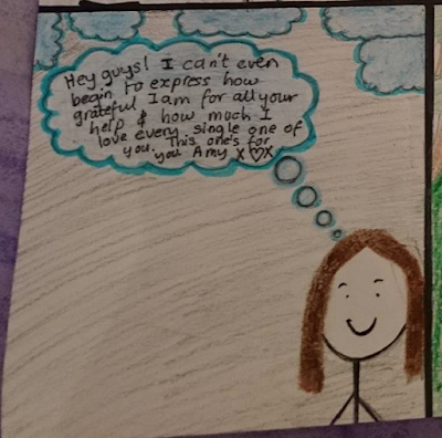
A requirement of a digipak is to include a personal note from the artist. Therefore, one of the six sides of my digipak that I have planned out includes this. The design I have chosen for my own personal note is to have a mid shot image of the artist with a thought bubble coming out of her in the shape of a cloud, along with other smaller clouds around the main big cloud. In this thought bubble cloud will be the personal note. I have chosen this design as I was inspired by Gabrielle Aplin's digipak as she had strong connotations of escaping and being free, through the use of balloons and umbrellas. Using clouds would effectively appeal to my target audience as firstly, it is a more creative approach than simply written out the personal note on a plain background; the audience are of a younger age (15-25) and would therefore appreciate creativity as they would stereotypically like fun and playful things. It will also appeal to the target audience as it connotes the idea of having your "head in the clouds", which a lot of the 15-25 age group can deeply relate to. In addition, this consequently helps to promote the artist positively as she will seem more like an ordinary and relatable figure for the audience, as she is represented as being quite young, carefree and friendly, with a lot of normal and stereotypical youthful qualities. The image I chose of the artist is a mid-shot; most of my digipak sides have an image of the artist but do not clearly show her face and therefore I wanted at least one where her face was in clear show. The layout of the personal note has been carefully designed so that the page is neatly ordered; there is activity in both the top and bottom of the digipak side; however I have balanced it out so that it is not a lot for the audience to take in. In addition, as this digipak side contains the most writing, I have made sure that the writing has been contained in just one place so that the page is not busy for the audience and they can quickly read what they need to, without struggling to take everything in. The actual typography I have used is again, extremely simple. I did not want to use fancy font as this is both unconventional of the indie genre, as well as having looked out of place alongside the rest of my digipak. The language I chose is also simplistic as despite my age range being 15-25, and therefore being well abled in a literary aspect, they actually do not appeal to fanciful and cerebral language; they care more about colloquial language, e.g. "hey guys!" instead. Therefore, I have taken care to shape my writing around the appeals of the relevant age group. I have chosen to keep the color scheme quite simple as the main focus is the personal note. Therefore, I have opted to only use color on the clouds; instead of keeping them white and having the sky blue, I have decided to use blue for the clouds as I wanted them to stand out as much as possible. I also wanted to keep to the use of greyish tones for the main background to clearly juxtapose with any brighter use of color - in this case, the clouds, which need to be brighter as they need to be positive and happy as the note is in one of them. Depending on how it turns out when I come to using Photoshop, I am either going to have all the clouds - except the one with the note in it - in a more prominent shade of blue than the one containing the note, or reversal. This way, it will become quickly evident what is the main focus; it also just helps to keep the digipak side looking as interesting as possible. It is also conventional of the indie genre to use a simple layout and color scheme and to maintain this outlook all the way through my work, I have ensured to conform to this convention in this side of the digipak.


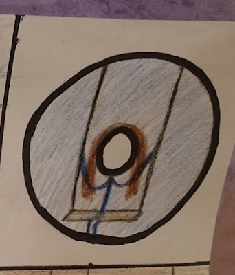
Coming up with an innovative idea for the CD design of my digipak was also crucial. I was inspired by the design idea when my group and I were going through some of the footage we took for the music video. In one of the beginning scenes of the video, the artist is on a swing; I chose to take this and use it on the CD. As the CD has a circular hole in the centre of it, I draw my artist on a swing around this centre, as I thought the hole would create a creative privation of the artist's face. As mentioned previously, it is not conventional of the indie genre to heavily feature the artist' face and therefore I have conformed to the conventions. The lack of face actually would appeal to the audience as it is quite a unique idea and it also relates to the music video for one of the songs featured in the album; therefore, if the audience have seen the video, which a lot of them will have, then they would understand the link. This is instantly more appealing as it makes the audience feel as if they are in the know of something only certain individuals would understand and therefore makes them feel more special and connected to the artist. The design I chose also helps to promote the artist as it connotes the artist to be quite enigmatic, which will intrigue a lot of people as naturally, humans are curious to know more. I am yet to decide whether I would like for the CD to simply be an image of the artist on a swing with the background location in sight, or instead, edit out the background and just have a colored but plain background. When I get to the stage of using Photoshop I will be able to quickly decide as I will be able to really see what the CD will look like and be able to compare it against the rest of my digipak to see what works best. If I do choose option A of having the original image, then I will still edit it and put a filter on it to increase the darkness and saturation in the centre of the CD, and have the brightness increase at the edges of the CD, as I think this would make it stand out more and look more creative and original. However, if I choose option B of editing out the background, then I will use a plain color of blue or green as these have been dominantly used throughout the rest of the digipak. 


This is one of the two sides of the digipaks that will be images for my booklet. This image I have chosen is simply an extreme long shot of the artist standing on a hill, overlooking the scenery. I chose to use a long shot as I wanted to capture the location as well as the artist within it. Furthermore, as I have previously used an image of London for the back cover of my digipak, I wanted to ensure that both locations used in the music video would be included in the digipak. I also chose to include the artist as I wanted to draw from the performance side of the music video in that the artist is standing all alone and therefore suggest to the audience that this album is going to be quite personal and a get-to-know the artist as you will see her on her own, and away from everyone else and therefore really connect with her. Unlike some of the other images, this image will be taken as one element, in that the artist will actually be standing on this hill, as opposed to editing her in another image, e.g. through the use of a green screen. As this image will not contain any typography, I want it to stand out as much as possible, so I will edit it by putting a filter on that increase the brightness and strengthens the color elements within it. 


This is the last side of the digipak I planned out and the last of the two images I am going to use for my booklet. This is simply an image of the artist standing in front of a brick wall. In our music video, we were actually going to use this location for the artist to sing in front of, so that is what inspired me to use this image. It is also a good image as it is a full(/wide) shot of the artist, so the audience can clearly see her face and the outfit she is wearing. When I take the picture for the digipak, I will take multiple from different angles, e.g. from the front where the artist is looking directly at the camera, from the front where the artist is looking down at the floor and from either sides where the artist is looking across, out in the distance. This is simply due to the fact that I have not decided what will look best and therefore would like a range to choose from. I purposely chose a shot that includes the artist's entire body as I want the audience to see at least one clear example of the style of clothing that the artist prefers as this is a good way for the audience to build a connection with the artist. If the artist is wearing clothing that appeals to both the genre and the target audience, then they will be better promoted as the audience will aspire to have the types of clothing the artist does as well as conforming to the indie genre in their clothing style which the audience will like. I think this image would best suited to be edited where the contrast is increased and a strong filter with a bold tone is placed on it as a brick wall is quite a rough looking background in the sense that you would not want a bright or soft looking image.

Overall, all the planning I have done for my digipak largely differs from a jewel case CD; the latter focuses more on simply gaining as many sales as possible, whereas digipaks focus on the relationship between the audience and the artist. Digipaks have been carefully thought out to provide the audience with as much content from the artist as possible and to give them something back for their loyalty, e.g. the time and effort spent on the artwork of the booklet and the personal note from the artist. The style of language and the typography used in jewel case CDs would also greatly contrast, as digipaks spend more time and care upon carefully constructing what they write as they want to appeal to the audience as much as possible. All the planning I have done for my digipak has been extremely helpful, especially in regards to taking pictures and preparing me for the use of Photoshop. I now have list of all the relevant pictures I will need, which I can share amongst my group to ensure that if they are filming a particular scene which involves the location of one of my images, they can take the picture for me. For example, Molly was set with the responsibility of filming the scenes at Theydon Bois, where the swing is, and therefore I need to make sure I let her know what images I would like. I have also been prepared for the use of Photoshop as I now how I want to edit all the images I have. For example, in the image for the CD design, I do not specifically know how I want the final outcome to look yet, but I know how I want to approach the outcome; I have two different options and I now know how I am going to edit the image to get there. Conclusively, I am now very aware of the images I need for my digipak and from analyzing and talking about my digipak plan, I am confident in my chose of them.


Sunday, 15 November 2015

music video inspirations

Inspirations are important to take into considering when producing a music video, as having a variety of ideas means that your music video is more likely to include conventional elements to the genre that you have repeatedly seen in various videos. In addition, your music video is more likely to be more creative and have an interesting narrative is you take inspirations, rather than just coming up with a narrative from the top of your mind. It is also beneficial as you can see what famous artists have included in their music videos to make them so successful and therefore enhance the quality of your own video.


The first video I have taken inspirations from is Kodaline's "All I Want". There are two parts (videos) for the song and in the one I have picked, there is a strong use of editing of colors and filters. The video has been edited so that the saturation has been slightly drained in some scenes which is extremely useful when creating a more melancholy feeling. Goodwin's theory of there being a relationship between the music and the visuals can be applied here as the dull and blander colors match the mood of the music at specific points. This relates to my own music video as my song my group and I have planned to gradually reduce the saturation and brightness of the scenes as the video progresses as the narrative becomes increasingly depressing. We ourselves would like to ensure that the music matches the visuals - as Goodwin proposes is essential - as it creates a more successful video due to the ability for the audience to actually feel the emotions the characters are going through. My group and I have planned out a rough plot for our music video and we wanted to make it quite different to what you would expect. Therefore, in order to truly illustrate the emotional intensity of the video, the visuals must match the lyrics and the musical tones. The best way of doing this is as Kodaline's video for "All I Want" shows: changing the saturation and brightness, etcetera. Furthermore, despite the plot for "All I Want" not being the same as for my own music video, it inspired me to filter some of my scenes to make it look duller so that it looks like an analepsis, as the present-time scenes in my video will be brighter, with a higher saturation, etcetera. 


In Birdy's music video for "Wings", she makes good use of vintage style clothing. As this is an indie genre convention, I thought taking this as an inspiration would make my own video more successful. Despite the fact that my music video will be set in contemporary times, I still want there to be a prevalent vintage feel to it. Therefore, the costumes that I want to pick for the characters will be less modern. However, I do not actually want to completely use this inspiration in the manner that Birdy's costumes in this video are too extravagantly vintage. Instead, this video has inspired me to somewhat go against mainstream fashion trends and use clothes which the audience would aspire to have as it is different from what they normally see. However, I would not completely want to go against mainstream conventions as having a completely different style of clothing to what the audience may be used to seeing would create a distinct separation between the artist and the audience; they have to be able to relate to the genre convention of the clothing. Whereas in Birdy's video, the clothing the characters are wearing are completely unattainable as nobody would wear the clothes on a daily basis. One example of how I am going to use this inspiration in my own music video is by thinking about using dresses for the female artist, instead of jeans, as this both conforms to the indie genre as well as keeping in line with the vintage theme. From prior research, such as looking at Dyer's theory of stars, I used this inspiration from Birdy to try to plan out how to best represent my artist as being both ordinary and extraordinary. Therefore, I evidently do not want to use clothes that the audience would not be able to affordably obtain, however the clothing must make audience want to wear what the artist does, which Birdy's video has inspired me to ensure. 

This music video also aided in getting an inspiration for the how to best represent my artist; Birdy represented quite stereotypically: as she is young, she is quite care as demonstrated by the excessive partying. However, there are actually two representations of her as the video makes strong use of cross-cutting between two different scenes; one of them displays Birdy partying with a lot of other people and the other shows her on her own, singing. The use of illustrating two sides of the artist is something which I wish to employ in my own music video as I think it is an effective way to connect with the audience as they are getting to know the artist more. Having two different representations also relates to the audience as it shows what the artist is like when they are with people but ultimately they may feel alone, which a lot of the target audience will understand and relate to. Furthermore, to further pull on the audience's emotions, the video makes use of close-up shots of the artist when she are sitting alone as well as wide shots to really display their isolation and loneliness. Both these shots are extremely effective and therefore have inspired me to use in my own video. I like the use of the close-up shots as it means you can really see the artist's facial expressions and therefore the audience can sympathize with the audience more. The close up shots allow you to clearly see what the artist is feeling, and in the case of Birdy, she never smiles; this has inspired me for my own video as due to the fact that my music video will have performance and narrative aspects, I can use a lot of close-ups in the performance parts to show the artist's emotions. This is useful as the performance parts will be in between the narrative shots and therefore allow the audience to really get to know the artist more; they will be able to clearly see the two sides of the artist, one when they are alone and the other when they are with other people. On the other hand, the wide shots are good as you can see the location as well as the artist and therefore get more of a feel of the video, as well as making the artist look smaller in comparison to everything else and exemplifies her loneliness. I want to incorporate this in my music video, as I want to establish the setting of the video, as it will be set in the countryside, and show the artist within the setting. This way, the video will seem more authentic and have a more rustic feel to it, which will appeal to the audience. The video has inspired me to ensure I use a variety of shots in every part of my own music video.

In addition, from watching Labrinth and Sigma's "Higher", I can see a good variety of cinematography that I could potentially apply to my own music video. One specific shot I liked was the use of a panning shot. In "Higher", a panning shot is used from a high angle taken in a helicopter. Evidently, my budget does not stretch as far as being able to afford a helicopter; however, the same principle of the panning shot can be applied. In my own music video, the panning shot will be useful in the car scene where the two characters are driving along and they break down. The use of a panning shot will allow the audience to get a scope of both the characters in the car and the surrounding location. This way, the audience will consequently get more of a rustic feel from the video, a convention of the indie genre. Furthermore, a panning shot is a good way to establish where the music video is set and therefore can give the audience clues as to the plot of the video. Whilst watching "Higher", I was able to quickly come to the conclusion that the video was going to have some sort of allusion to climbing a mountain, perhaps both metaphorically or literally as the panning shot showed a whole scope of the location, which enabled us to see footsteps of someone climbing "Higher" up a slope. I was therefore inspired to use the same idea within my own music video, as the panning shot could give the audiences suggestions as to what is going to happen; this is appealing for them as it is exciting to try to figure out what is going to happen.


Another inspiration I have taken is from Tom Odell's "Grow Old With Me" music video. The inspiration I took was the use of both narrative and performance concepts as I think this will make a more appealing video. Tom Odell features in the video as he plays the piano as well as sings. In my own video, I want to include the artist playing the piano as well as I think playing a musical instrument will help to portray the artist as being extraordinary as well as ordinary, as Dyer's paradox theory suggests. This is more effective as the target audience will aspire to be more like the artist and appeal to the video more as it keeps it as interesting as possible. In "Grow Old With Me" the artist plays the piano as well as sing which attracts the audience more as it means those who unfortunately cannot see Tom Odell play live, will actually feel like they are able to. Having this experience is essential for the audience as they want to be able to connect to the artist as much as possible. Therefore, I want to use this performance aspect in my video and make it look as realistic as possible. My own artist, Amy, will be filmed playing the piano as well as being filmed just singing to the audience; in the editing, we can cross-cut between the performance shots we would like to use. I have also been inspired by the narrative aspect of Tom Odell's music video. Furthermore, as I plan to include a variety of different shots, as Tom Odell does in his video of "Grow Old With Me", it will keep the audience immersed in the visuals as they can truly see the passion he has for playing the instrument. I want to incorporate this very passionate approach in my own video, as I want it to seem as realistic as possible. In addition, having a narrative aspect to the video is beneficial as it gives the lyrics meaning and brings them to life which is something I personally think is exceedingly crucial, especially within the indie genre which is all about deeper meanings and connotations. Furthermore, the narrative and performance aspect will link together as it will create the effect that the artist is singing about a real-life and personal experience; therefore, the music video will be a lot more emotional and meaningful, which is how I want my own video to be like. In Tom Odell's video for "Grow Old With Me", he uses a young boy and girl, rather than a more adult couple. This is surprising as you do not expect the artist to be writing about children; therefore after watching this video, I was inspired to think outside of the box with my own music video and try to turn away from the automatic assumption or connotation the audience may jump to about the lyrics. For my own video, I want the plot to have an unexpected turn, such as the male protagonist dying, as the audience would not expect this after reading the lyrics. This way, the video will be more unique and therefore more interesting.

To conclude, having musical inspirations is extremely helpful as it is something to guide me whilst producing my own music video. I definitely think having an indie genre music video is the best option as it gives a lot of freedom as to what elements to include. Furthermore, having both narrative and performance styles of music video is a strong option to take on as it is far more interesting and appealing for the audience due to deeper meanings and emotions which are expressed throughout. For the audience of the indie genre, this is something which they strongly appeal to. As I have watched a lot of indie genre music videos, I have a lot of ideas of what to include and how to make it stand out from other indie music videos. Planning out my own inspirations is useful as it allows me to compare and contrast with my group's individual inspirations and take bits and pieces of ideas from everyone's. For instance, one person liked the use of the countryside location, whereas another person liked the city location; therefore we were able to employ both settings in our music video by having fast-paced scenes of London edited in at specific points. This effectively creates a more personal and unique music video as my group and myself were able to plan out exactly what we personally liked, which is important as the target audience will be of a similar age to ourselves and therefore will be likely to appeal to similar elements we do.