In order to make the production of the music video as successful as possible, it is essential to carry out audience feedback as well as having a rough cut. This is due to the rough cut allowing you to make further improvements after the audience have watched it and given any constructive criticism if necessary. The purpose of creating a music video is to appeal to the audience and therefore it is their opinion that is crucial when reviewing the success of the production. Hence, if you make a rough cut and allow people to comment on it, it means that they are telling you how to improve it how they would like it to be. Furthermore, by having the audience give feedback it could mean that you discover something which a lot of people dislike and therefore be able to change it to make it. The purpose of having a rough cut is simply as you need a draft before you can say you have completed your production; the music video can only be deemed as done once all your audience feedback is positive. It is crucial that whilst you may have an idea of what the target audience may generally want, that you pinpoint precisely what appeals to the age group and therefore tailor your music video to the consumer's needs.
The way in which my group and I received feedback from the target audience was through a variety of methods including creating a questionnaire, using Youtube, screening our production and using a focus group. When we researched into our chosen target audience, my group and I compiled a set of questions aimed at what aspects the audience prefer in a music video.
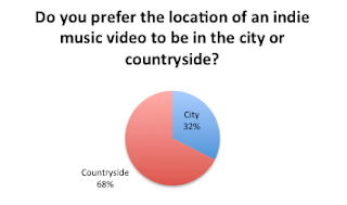 For example, we asked whether the audience would prefer the location of the countryside or the city within an indie music video. As 68% said the countryside, we kept our music video predominantly based in this style of location; however, as we also wanted to appease the other 32% we included a few very small shots of the city of London, edited in as a time-lapse. This was extremely advantageous to us as it meant that our music video was not restricted by whom it would appeal to. Rather, a larger group of consumers would enjoy it and therefore this makes the production favourable. Looking at the questionnaire is beneficial for making the music video more unique, as it means that we can ensure to employ the most favourable option in our video, as well as working with the other answers to see how we could best include them in. Most people would not expect to see a city landscape in an indie music video and therefore going against generic conventions ensures that people would be more interested whilst watching it as it is not just everything they always see in an indie video.
Another method of receiving feedback was by screening our production. When a member of the grime group "Boy Better Know" came in to the class and watched our music video, he gave us some constructively critical comments. One of the comments he made was to ensure that there were more emotional scenes in the video, as due to this being an indie music video, the audience really have to feel the intensity of it. As we were still in the process of making the video, we were able to include more scenes like this; for example, the scenes of the couple on their first date or laughing together when the car broke down. We also put in the scene of the artist spreading the ashes of the male protagonist. Although we initially had planned out to include these scenes in the video, the comments were helpful in ensuring that our filming and editing would really procure a lot of emotional response from the audience as we kept this advise in mind.
Using a focus group was another way of gaining audience feedback, as this involved the actual target audience of our music video to watch it and make comments. This was really useful as these were people of the age we were aiming the music video at to give us substantial feedback. The opinions of the audience of this method were especially important as it gave my group and I a good idea of what the general consensus of the video may be when we upload the final version. Many of the people of the focus group were in fact classmates which was advantageous as it meant that while we were still in the process of making the music video, they were able to watch what we had done and comment on any potential improvements we would be able to make in time before the deadline. Some of the comments included to work on the editing aspect as some people did not feel as if the majority of the narrative was set in a flashback. We therefore took these comments on board and applied further editing to the music video.
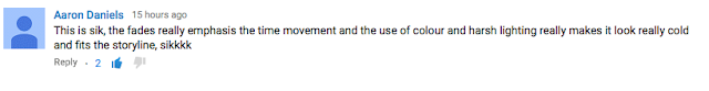 Above is a screenshot of a positive comment we received. Having a favorable comment such as this one is useful to my group and I's production as it shows us that we have succeeded in a specific aspect of making the music video. Aaron's comment that we have effectively used color and lighting well allows my group and I to be confident in that our purposefully done editing has had the connotations and impact we hoped. The description of the lighting being "harsh" is important feedback to read as it shows that the audience understands that this is not just a happy memory and that there are sad tones to it, as "harsh" has negative connotations. The flashback was an important aspect of our music video as we really wanted the audience to immediately get the impression that they are delving into the mind of the artist and looking at a memory, as this makes the music video more personal and therefore more appealing for the audience. The comment shows us that members of the audience are able to acknowledge the meaning behind choosing certain editing techniques and that a particular effect is supposed to be gained from this. However, other comments, such as those of the critical category shows my group and I that not everyone was too sure about the differentiating colors.
 The screenshot above consists of both a negative and positive comment. The critical of the two comments shows how the audience member actually found the various colorings and filters edited on the shots confusing. This is useful in showing us that perhaps my group and I needed to think about whether everyone would understand why the first few shots and the ones following are of different colors. Due to this being a concerning comment as it shows that other audience representatives could also find the video slightly confusing. Therefore, my group and I need to think about how to best correct this; one way could be through the use of putting a more old-fashioned style filter on it, one that will make it more evident that this is a flashback. However, the audience also included a positive comment in that the narrative was clear to them and extremely detailed given the little space of time. This is a useful comment to acknowledge as it shows that my group and I have really thought out the narrative and only chosen key scenes we know will effectively reflect and tell the story of the lyrics. As it is a strong convention of the indie genre to show a story in the music videos, we wanted to make sure we strictly conform to this.
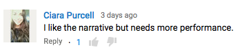 Another constructive comment made on Youtube was that our video needed more elements of a performance style of music video in it. As it is a convention of the indie genre to include shots of the artist playing a musical instrument, my group and I evidently wanted to include this. However when we researched our own artist's - Gabrielle Aplin - music videos and found that songs such as "Please Don't Say You Love Me" and "Panic Cord" had more narrative aspects to it than performance, as did any other indie artists. In fact, the rare videos we did find where the performance side of the music video heavily dominated the narrative, my group and I found that they were not as interesting and appealing as mostly narrative style videos. In addition, our group and I found that the only way to truly get the deep meanings behind our emotional lyrics across was to use quite a lot of narrative, as this is the most efficient way to tell a story. As indie music videos are usually based upon real-life events, if the audience cannot see the lyrics come to life then they will not see the artist's music as being as relatable or realistic. However, as we appreciated the person's comments, we decided to review our music video to see where we could appropriately make changes. We found that by editing some narrative scenes to make them slightly shorter or chopping them up more, we would effectively put in short performance clips in between these shots. This way, there are firstly a good range of performance shots in the video, as well as the fact that they effectively separate the video more. It was beneficial that we had intelligently pre-planned to film extra footage of everything, especially the performance shots just in case we needed more. It is generally quite important that there are a good range of performance shots in our video, to firstly break up the narrative to add more dynamics and secondly to show another side of the artist, one where she is portrayed as extraordinary and an inspiration for the audience.
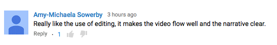

The two comments above both show positive attitude towards the editing of the music video. As you cans see, the editing seemed to really work well and hold the whole video together. Tyler's comment about the fades between shots was beneficial as we actually spent a lot of time putting these in as we personally thought they made the video flow more effectively; seeing an audience member comment this provides us with confidence in our choices. Throughout the video we used a cross dissolve style of transition between many of the shots as it meant they would not suddenly jump cut one after the other but rather flow so that you would not even think about how the shots have been taken at different points.
 The last constructive comment we received was concerning the verisimilitude of aspects such as the theme of war. Harry commented how the locations we chose for the male protagonist to be in whilst he is "off at war" were not realistic enough. Whilst we were planning these scenes we thought about filming them in a big field, however there was a risk that someone would think we were actually using a real gun. Therefore, we decided to use a garden as a location. We evidently could not actually simulate a war-zone, which is why we predominantly focused on close up or mid-shots of the male protagonist, rather than wide shots of the location. We did include a shot of the male character picking up a gun and shooting it as well whilst he was wearing his army hat, which was all that we could manage with the limitations we were faced with. And I do think my group and I pulled off this part of the narrative extremely well, all things considering.
In conclusion, all the comments made on our rough cut version of the music video were exceedingly beneficial towards improving the production as they meant they we would be taking onboard what the audience want to see. The positive comments were evidently nice to read and they showed us what we had done well and can be left alone; however the criticisms were the key comments to read as they show how we can make our music video more unique and appealing for the audience.
The way in which my group and I received feedback from the target audience was through a variety of methods including creating a questionnaire, using Youtube, screening our production and using a focus group. When we researched into our chosen target audience, my group and I compiled a set of questions aimed at what aspects the audience prefer in a music video.
 For example, we asked whether the audience would prefer the location of the countryside or the city within an indie music video. As 68% said the countryside, we kept our music video predominantly based in this style of location; however, as we also wanted to appease the other 32% we included a few very small shots of the city of London, edited in as a time-lapse. This was extremely advantageous to us as it meant that our music video was not restricted by whom it would appeal to. Rather, a larger group of consumers would enjoy it and therefore this makes the production favourable. Looking at the questionnaire is beneficial for making the music video more unique, as it means that we can ensure to employ the most favourable option in our video, as well as working with the other answers to see how we could best include them in. Most people would not expect to see a city landscape in an indie music video and therefore going against generic conventions ensures that people would be more interested whilst watching it as it is not just everything they always see in an indie video.
Another method of receiving feedback was by screening our production. When a member of the grime group "Boy Better Know" came in to the class and watched our music video, he gave us some constructively critical comments. One of the comments he made was to ensure that there were more emotional scenes in the video, as due to this being an indie music video, the audience really have to feel the intensity of it. As we were still in the process of making the video, we were able to include more scenes like this; for example, the scenes of the couple on their first date or laughing together when the car broke down. We also put in the scene of the artist spreading the ashes of the male protagonist. Although we initially had planned out to include these scenes in the video, the comments were helpful in ensuring that our filming and editing would really procure a lot of emotional response from the audience as we kept this advise in mind.
Using a focus group was another way of gaining audience feedback, as this involved the actual target audience of our music video to watch it and make comments. This was really useful as these were people of the age we were aiming the music video at to give us substantial feedback. The opinions of the audience of this method were especially important as it gave my group and I a good idea of what the general consensus of the video may be when we upload the final version. Many of the people of the focus group were in fact classmates which was advantageous as it meant that while we were still in the process of making the music video, they were able to watch what we had done and comment on any potential improvements we would be able to make in time before the deadline. Some of the comments included to work on the editing aspect as some people did not feel as if the majority of the narrative was set in a flashback. We therefore took these comments on board and applied further editing to the music video.
The final technique my group and I used to get audience feedback was by posting our rough cut of the music video onto Youtube and getting people to watch it and give either a positive or constructively critical comment on it. In total we chose 3 positive and 3 negative comments, to give a substantial amount of feedback. This way, we could see if anyone's comments overlapped, which would be a beneficial pointer to change something.
 Above is a screenshot of a positive comment we received. Having a favorable comment such as this one is useful to my group and I's production as it shows us that we have succeeded in a specific aspect of making the music video. Aaron's comment that we have effectively used color and lighting well allows my group and I to be confident in that our purposefully done editing has had the connotations and impact we hoped. The description of the lighting being "harsh" is important feedback to read as it shows that the audience understands that this is not just a happy memory and that there are sad tones to it, as "harsh" has negative connotations. The flashback was an important aspect of our music video as we really wanted the audience to immediately get the impression that they are delving into the mind of the artist and looking at a memory, as this makes the music video more personal and therefore more appealing for the audience. The comment shows us that members of the audience are able to acknowledge the meaning behind choosing certain editing techniques and that a particular effect is supposed to be gained from this. However, other comments, such as those of the critical category shows my group and I that not everyone was too sure about the differentiating colors.
 The screenshot above consists of both a negative and positive comment. The critical of the two comments shows how the audience member actually found the various colorings and filters edited on the shots confusing. This is useful in showing us that perhaps my group and I needed to think about whether everyone would understand why the first few shots and the ones following are of different colors. Due to this being a concerning comment as it shows that other audience representatives could also find the video slightly confusing. Therefore, my group and I need to think about how to best correct this; one way could be through the use of putting a more old-fashioned style filter on it, one that will make it more evident that this is a flashback. However, the audience also included a positive comment in that the narrative was clear to them and extremely detailed given the little space of time. This is a useful comment to acknowledge as it shows that my group and I have really thought out the narrative and only chosen key scenes we know will effectively reflect and tell the story of the lyrics. As it is a strong convention of the indie genre to show a story in the music videos, we wanted to make sure we strictly conform to this.
 Another constructive comment made on Youtube was that our video needed more elements of a performance style of music video in it. As it is a convention of the indie genre to include shots of the artist playing a musical instrument, my group and I evidently wanted to include this. However when we researched our own artist's - Gabrielle Aplin - music videos and found that songs such as "Please Don't Say You Love Me" and "Panic Cord" had more narrative aspects to it than performance, as did any other indie artists. In fact, the rare videos we did find where the performance side of the music video heavily dominated the narrative, my group and I found that they were not as interesting and appealing as mostly narrative style videos. In addition, our group and I found that the only way to truly get the deep meanings behind our emotional lyrics across was to use quite a lot of narrative, as this is the most efficient way to tell a story. As indie music videos are usually based upon real-life events, if the audience cannot see the lyrics come to life then they will not see the artist's music as being as relatable or realistic. However, as we appreciated the person's comments, we decided to review our music video to see where we could appropriately make changes. We found that by editing some narrative scenes to make them slightly shorter or chopping them up more, we would effectively put in short performance clips in between these shots. This way, there are firstly a good range of performance shots in the video, as well as the fact that they effectively separate the video more. It was beneficial that we had intelligently pre-planned to film extra footage of everything, especially the performance shots just in case we needed more. It is generally quite important that there are a good range of performance shots in our video, to firstly break up the narrative to add more dynamics and secondly to show another side of the artist, one where she is portrayed as extraordinary and an inspiration for the audience.

The two comments above both show positive attitude towards the editing of the music video. As you cans see, the editing seemed to really work well and hold the whole video together. Tyler's comment about the fades between shots was beneficial as we actually spent a lot of time putting these in as we personally thought they made the video flow more effectively; seeing an audience member comment this provides us with confidence in our choices. Throughout the video we used a cross dissolve style of transition between many of the shots as it meant they would not suddenly jump cut one after the other but rather flow so that you would not even think about how the shots have been taken at different points.

In conclusion, all the comments made on our rough cut version of the music video were exceedingly beneficial towards improving the production as they meant they we would be taking onboard what the audience want to see. The positive comments were evidently nice to read and they showed us what we had done well and can be left alone; however the criticisms were the key comments to read as they show how we can make our music video more unique and appealing for the audience.


