digipak analysis
A digipak is a format of packaging for presenting music on CDS. As opposed to the common and traditional use of just a mere plastic case for the CD, a digipak consists of a plastic case which is slotted into a cardboard holder for protection. Furthermore, the digipak and the jewel CD case have different purposes: the purpose of a digipak is to give the audience something more than just the CD itself. A digipak is a lot more personal as it contains a letter or a note from the artist, addressed directly to the fans. This is not something you conventionally find when buying an artist's music and therefore it is almost like the artist is giving something back to the fans. The high quality of the images and artwork used is a lot more appealing for the audience as it gives the digipak more meaning than just a product to sale. The addition of bonus tracks is sometimes contained in a digipak which is another way of giving something more to the artist's fans. A digipak has a more efficient purpose than a normal jewel CD case as it features six sides as opposed to the latter's mere four sides. This means that there is more visible artwork which is a good way to attract buyers as it makes the album more interesting and stands out against other albums as the artist has the opportunity to be a lot more creative. The easy accessibility to information is again another appealing aspect to a digipak and as it is more long-lasting it is better than a jewel CD case.

The digipak I am going to analyze is for my chosen artist, Gabrielle Aplin, who released her debut album "English Rain". The digipak uses a lot of the conventions of the indie genre as the first noticeable aspect to it is its simplicity. Despite the lack of elaborate artwork, the artist uses one central theme throughout the digipak: the use of an umbrella image links with the title of the album "English Rain". The immediately noticeable contrast between the use of greyscale and the brighter colors used on the umbrella and also the balloons makes the digipak a lot more eye-catching and unique. The images used throughout the digipak have all been aligned centrally which is useful in quickly grabbing the audience's attention. In addition, all the images link together so there is a sense of purpose and regularity through the digipak which is a lot more appealing for the audience as it gives the impression the quality of the music inside will also be high. Despite the artist's face not appearing in a large image to quickly draw the audience in, the artist uses a handwritten signature in the digipak which makes the audience feel as if the artist actually made it with the intention of giving it to that fan specifically and therefore it is still very personal. In addition, Gabrielle includes a kiss at the end of her signature which is something you would conventionally put after talking to someone you like; therefore it is just another way to attract the audience and make them feel like they really want to buy this digipak. Although not with handwritten typography, the artist has also put their name on almost every other part of the digipak, which is just a useful way of keeping the artist firmly established in the audience's mind. Furthermore, the typography used on the front cover (and CDs) of the digipak is essential as the artist's name has been written in capital letters which creates a bolder display for the audience, attracting their attention more.
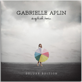
Gabrielle Aplin is represented as being evidently quite young and friendly, as she uses quite innocent images which reflects the target audience (15-25). The images of a balloon and an umbrella are quite childish in comparison to other genres which use more striking and provocative images. In addition, the use of pastel colors reiterates the representation of Gabrielle Aplin being quite young, playful and carefree as they are positive, happy colors. Moreover, on the front side of the digipak Gabrielle Aplin is holding an umbrella which is color, whereas the background is all in black and white. This represents the artist as being quite impacting on people's lives as it suggests that everything she touches brightens up. The use of low-key lighting in this side of the digipak contributes to this idea as well as the layout of Gabrielle Aplin being positioned centrally as there is heavy emphasis on her and the color. The shot used for this image is a long shot which is subversive to the genre conventions as you cannot actually see Gabrielle Aplin's face properly. Furthermore, the umbrella actually covers up her body which represents Gabrielle as being quite modest, subverting the expectation of women being provocative in music. However, it is arguable that the use of the greys and washed out whites connote a darker side to the artist and that although she may be young and targeting a younger audience, her music may be more serious and have deeper meanings. The color white is conventionally used to connote innocence and purity, yet it is washed out here which suggests that although her music may be innocent as a whole there is an underlying serious and darker tone. Furthermore, the use of the dark colors, added to the wide shot image of the artist in an isolated area altogether represent the artist as being somewhat introverted and disconnected from the rest of the world. This is useful in attracting the target audience as they themselves are at an age where a lot may be occurring in their lives and they feel disconnected from everything; therefore the audience would feel that they can relate to the artist more. The actual location used in the image is successful in promoting the genre the countryside/seaside setting used looks extremely still and calm; this reflects the gentle mood of the indie genre that uses a lot more simple and softer tones. Overall, this side of the digipak is very successful as the juxaposition between the brighter colors used in the umbrella with the dark tones of the remainder of the image tell the audience more about the artist: there is more to the artist that meets the eye. The audience should not jump to the conclusion that the music of the album is going to be depressing as grey and black colors have been used, as Gabrielle is shown holding a brightly colored umbrella too, bringing in positivity to the image. The audience therefore are more attracted to the digipak as it makes them feel more inclined to purchase it as they want to find out more about such an ambiguous artist.

For both CDs, the balloon and umbrella designs have been used again, keeping the digipak consistent. Both images have been used as iconography of the digipak as they create more meaning to the album. The use of purely brighter colors in both the CDs connotes that the actual music itself will be happy, positive and light. Furthermore, balloons connote freedom and flight which suggest that as opposed to the immediate assumption that the artist is lonely and isolated, as shown through previous images, she actually feels alive and free. In addition, the choice of the pastel colors helps with the representation of the artist being quite feminine and young. These two images evidently represent something more to the artist which is why they have been chosen as the design for the CDs, as opposed to having a picture of her face, as many other artists do. This promotes the indie genre as it demonstrates that the genre focus more on the content of their music and the deeper meanings behind it, rather than the face of the product and the celebrity recognition and status behind it.

Despite the lack of detailed information on the front of the digipak, there is some on the back. There is a list of the included songs in the digipak which is extremely useful for the audience as they can quickly see if they will actually like the songs on the digipak and therefore will be more likely to buy it. In addition, the songs are written using the same handwritten style typography the artist uses to sign her name. This again makes the digipak appear more personal for the fans as it gives the impression that each individual song has deep meaning behind it. The layout of the text is another important factor as it has deliberately been aligned centrally so that the list of songs included in the digipak are the focal point of the back cover. The use of a washed out white color of the clouds aids in the writing to be more clearly visible so that the audience can quickly read the contents, making the whole process of viewing the digipak easier for them. In addition, the choice in colors advocates the subversive representation of the indie artist as being darker and more rebellious. The spine of the digipak is also a noticeable feature in this image; it follows on with the black and white theme used throughout the digipak which helps to maintain regularity and high quality. The artist has kept the spine simple; the only information is the artist's name and the album title. However, Gabrielle Aplin has also included the Parlophone logo as this is the record label she is signed to which is an effective way to promote her as a music artist.
The choice of images is very important in a digipak and all the images that Gabrielle Aplin has included are extremely relevant. In the side of the actual digipak with the balloons on there is a background image of a field. The use of this location is extremely conventional of the indie genre as the artist likes to use simple, open and easily accessible locations to film in to reflect the simplicity and deep meaning to their lyrics. However, as the location has been edited with a black and white filter, we do not see the conventional Earth colors we usually see in the indie genre. This challenges the stereotype of seeing green colored landscapes in the indie genre as black and white is almost never used in the indie genre; it is more conventional of the soul genre. In fact, the theme of black and white is quite prominent throughout the digipak; even the text has been written in only black and white. This represents the artist as having two sides to her as black is stereotypically used to signify rebellion, whereas white signifies innocence and adhering to rules; having mixed representations of the artist makes the digipak a lot more interesting for the audience.
As a whole the digipak does promote the genre of indie music as it keeps with the convention of using a simple layout and design. Gabrielle Aplin has used virtually no text on the front and back - just the name of the album and her own name on the front and the songs included on the back. This makes the digipak a lot neater and presentable so that the audience do not feel overwhelmed. The digipak focuses a lot more on the artwork than the text as this is how to successfully attract buyers. Moreover, all the images used are of exceptional quality which tells the audience that there is real meaning behind them and they have not just been put in for absolutely no reason or purpose. The higher quality finish of the entire digipak makes it overall more appealing and long-lasting so that fans who buy it can actually keep a hold of it and appreciate it more.
From analzying this digipak I can now see how to make a more successful and appealing product for the target audience. As I am using a Gabrielle Aplin song, it is useful that I analyzed "English Rain" as I now know what the artist would include in her digipak. The most appealing aspect of the digipak for me is the creative use of color. I think for my own digipak I will employ the use of both greyscale and color as I want to make my digipak as interesting and creative as possible. Furthermore, I do not think I am going to include pictures of the characters on every side of the album, perhaps only one or two sides. For my planning I will need to think about what pictures are relevant to the song, as I cannot just use random pictures where none of them link together.


You have provided a good analysis of the digipak, explaining what the various connotations are of the elements used, and explaining how you will take on board some ideas and use it within your own digipak. You have considered the artist's representation and how the digipak appeals to the target audience, as well as generic conventions.
ReplyDeleteYou need to:
1) Explain all of your points fully, as some seem to be a bit rushed.